Intermarket strategies in grains
The stock market is embroiled in a never-ending chop, which is starting to drive people crazy. Yet, there are markets at unprecedented extremes, creating attractive opportunities. You just have to widen your perspective.
One such area is grains, especially the intermarket strategies between them. And make no mistake, despite not garnering as much attention as the stock market, major grains are very liquid markets.
The idea behind an intermarket strategy is to buy the commodity that is relatively undervalued and sell the commodity that's overvalued. Futures spreads are mostly used in practice, although combinations of ETFs are also possible. These strategies are not for beginners as they are usually capital intensive and require a deep understanding of various phenomena like the contango effect. However, their undisputable advantage is low correlation with broad markets and the ability to deliver great returns when other strategies struggle. Sounds a lot like these times.
In this post, I will point you to a few of the most interesting intermarket opportunities in grains, using the continuous histogram charts from the SpreadCharts app. This advanced analysis can help you spot market extremes in a second. It is available in the premium version of the app.
The first is the intermarket ratio between CBOT Corn and CBOT Soft Red Winter Wheat. Normally, wheat is more expensive than corn. However, the price of corn has recently exceeded the wheat price. That's rare.
How rare exactly? Well, the right boundary of the green area marks the 95% percentile on the selected historical period. In this particular example, it means that the ratio closed below this threshold in 95% of days over the past 20 years. And right now, we're even above this level (the vertical blue line). That's clearly unsustainable in the long term.
Another example shows an even greater extreme. It is the intermarket ratio between two types of wheat - KCBT HRW Wheat and CBOT SRW Wheat. Not only are we well above the 95th percentile, but there is, in fact, only one period in the entire history of the data when the ratio was higher than now. It was in 2006, and you can see what followed.
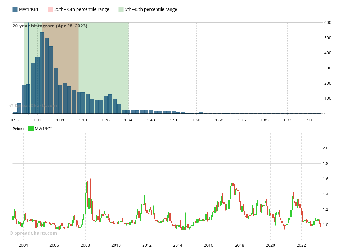
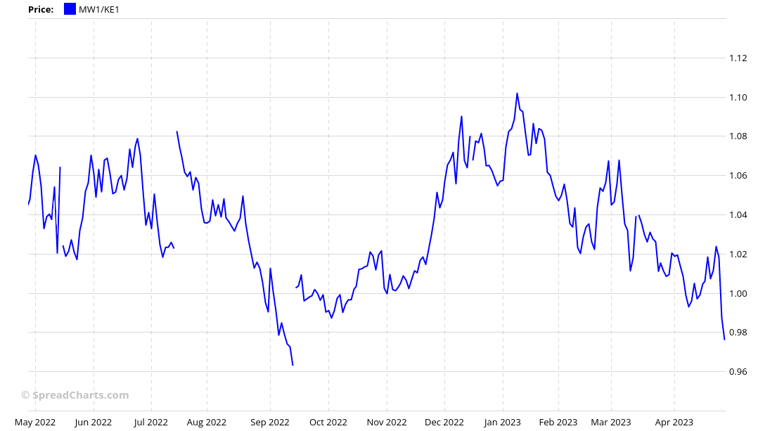
And finally, below is the MGEX HRS Wheat that recently became cheaper than KCBT HRW Wheat. This is not as rare as the previous two examples because we can identify periods where the ratio stayed below parity for an extended period of time. And the histogram confirms that, as the current value is still in the green area.
But it is still an interesting situation. Here is a closer look at the latest changes in the ratio.
While these charts are incredibly helpful in spotting the intermarket opportunities, they are not actionable signals. They tell us there is some extreme, but say nothing about how long such an imbalance can persist. The markets need a catalyst to reverse the trend. It is your job to identify it. But given the extreme states of some of these markets, it is only a matter of time before they start reverting to more normal levels.
If you enjoyed the article, please click the like button at the bottom. Thank you!
Disclaimer
All information in this post is for educational purposes only and is not intended to provide financial advice. If any financial instruments, strategies, securities, or derivatives are mentioned anywhere in this post, it is solely for educational purposes.
SpreadCharts s.r.o., its affiliates, and/or their respective officers, directors, and employees may from time to time acquire, hold, or sell securities mentioned here.
SpreadCharts s.r.o. and its representatives bear no responsibility for actions taken under the influence of information published anywhere in this post and linked resources. There is a risk of substantial loss in trading futures, options, stocks, ETFs, or other financial instruments.


